Having the right logo is paramount for any business, whether big or small. A logo design is more than a combination of graphics or symbols. It sums up what your business represents. And if designed correctly, a business logo seamlessly resonates with your intended niche audience.
The Challenge of Logo Design
To grab your audience’s attention, you must be deliberate about your logo design, regardless of your industry. For a restaurant, it could mean using a food logo that not only attracts patrons, but also conveys a message that makes them crave your food. What of the legal sector? If you design a law firm logo the wrong way, you risk compromising your professional image. The same applies to the banking industry. Your logo should be professional, give the correct business cues appropriate to your niche and set you apart from competitors.
Skimping through your business logo without extensive consideration isn’t only reckless, but may have dire consequences. You may be sending a completely wrong message. Historically, many brands can attest to this fact in hindsight after receiving unfavorable responses from the public.
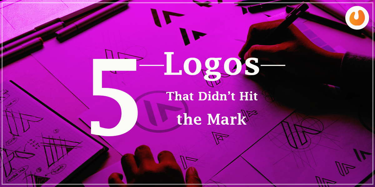
5 Logos That Didn’t Hit the Mark
We singled out only five from the thousands of brand logo designs that have had their fair share of controversy. Hopefully, you can learn what not to do when devising your own.
2012 London Olympics Logo
The 2012 London Olympics logo received much criticism from the public, so much so that at least 50000 people signed a petition requesting that it be changed.
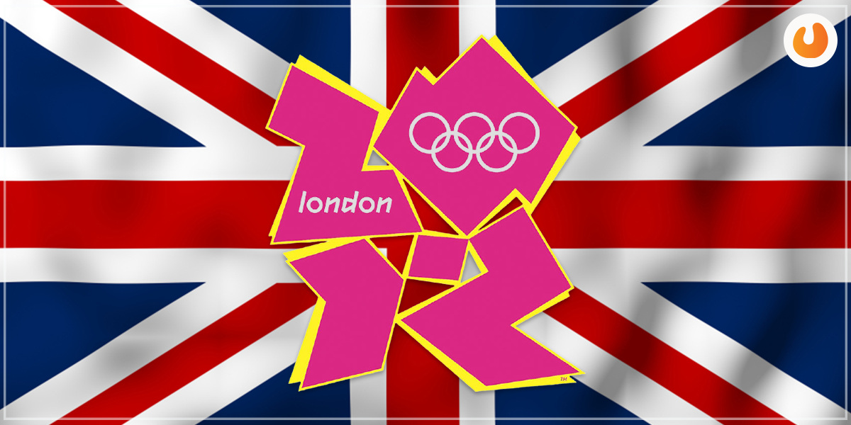
Given the amount of money and time that went into its design, one would never have guessed that it would be met with such ridicule. On the one hand, some people felt the logo resembled something out of a cartoon show rather than athletics. Others highlighted that it spelled the word “Zion”.
No matter the details, the fact that the logo caused confusion, attracted ambiguity and had multiple interpretations is a fail in itself.
Lesson: The right logo must be simple, concise, and easy to identify. Also, it must represent the business, or in this case, the event in question clearly. The 2012 London Olympic logo failed to tick any of the above boxes.
Also, Read – Need Of A Website Redesign With SEO
IHOP Logo
IHOP, a popular pancake restaurant chain in the U.S., managed to provoke public criticism after introducing their new logo. Some patrons felt it looked downright creepy, while others hinted that it looked like a clown about to have a mental breakdown. The graphics and choice of colors didn’t work in the brand’s favor.
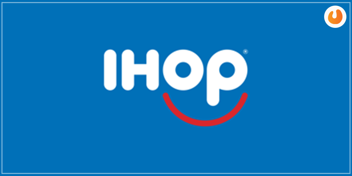
Lesson: It’s important to use the correct colors, fonts and symbols when designing your business logo. Always pick a combination of features that represent your brand well when designing your logo. Steer clear from bright and loud colors unless you want to appeal to a children’s niche or be perceived as Avante-Garde creatives. Remember that perception is everything to customers.
Procter & Gamble Logo
Procter & Gamble is a leading consumer brand whose logo also came under fire. The idea behind the company’s logo design was to push their “man in the moon” trademark, which has been in existence since 1851. The image was that of a man with a curled beard and hair protruding to form what looked like two horns, supposedly in the shape of a moon.
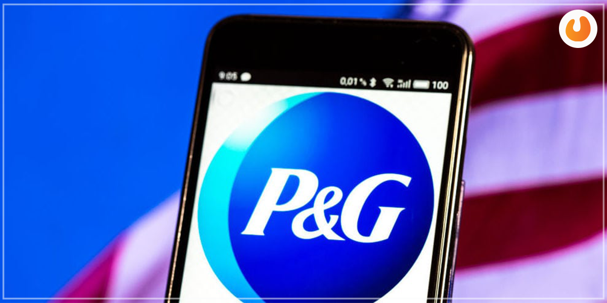
Interestingly, Procter & Gamble managed to maintain this logo for many years. Not until later did the company’s somewhat intriguing logo come under fire and start attracting closer scrutiny. Many people decided that the image had satanic connotations. As if that wasn’t enough, rumors started circulating about how the company president donated a lump sum of money to a “Satanic” church.
Also, Read – Content Marketing Tools
To set the record straight, the company filed and won a lawsuit for defamation against rival distributors involved in the rumors. However, to stop trending for the wrong reasons and attracting incorrect interpretations, the company changed the logo into simple letters.
Lesson: When designing your business logo, minimalism always wins. Make sure your logo is clear and straight-forward. Avoid playing around with images and symbols that can be easily misconstrued by the public. Simplicity is key.
London Rippers Logo
As mentioned earlier, having the right logo is crucial, regardless of your industry. The sporting fraternity isn’t exempted. This is evident by how the prominent Canadian baseball team, London Ripper’s logo attracted controversy upon its launch in 2012.
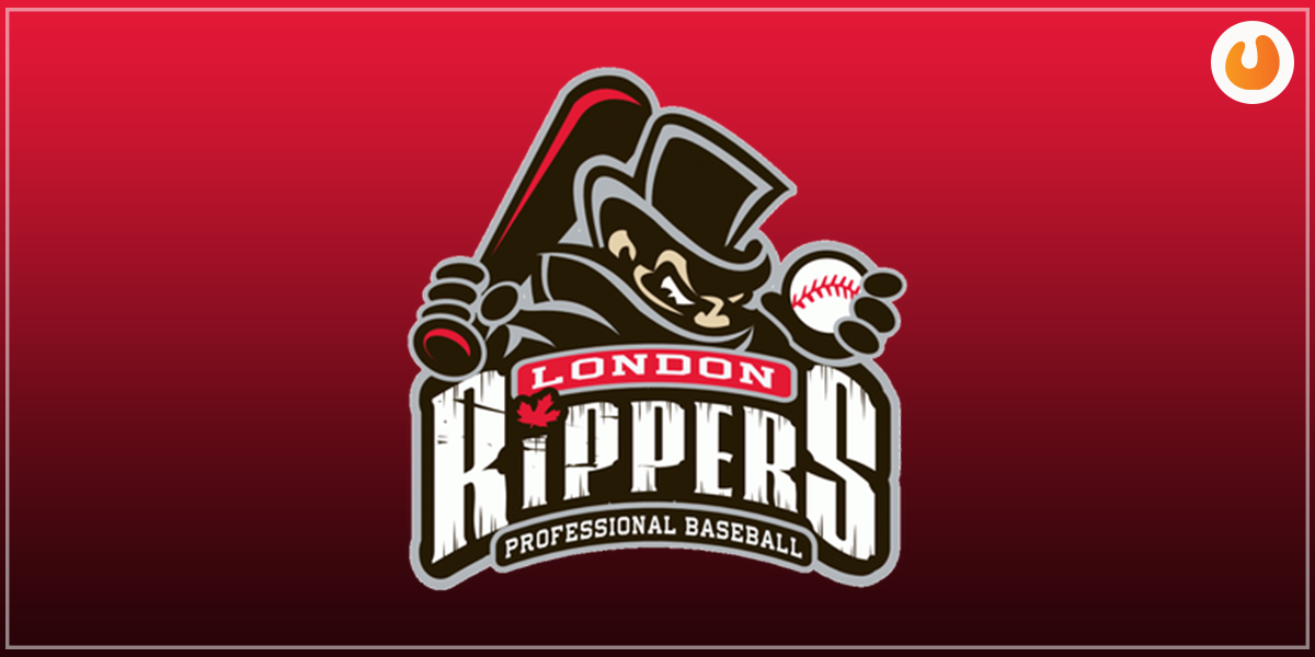
The logo was met by public outrage when many people assumed it represented a notorious British murderer, Jack the Ripper, from the 19th century. As a result, the logo was deemed racist and in poor taste. The club defended itself by suggesting that the character used in the image was in fact “Diamond Jack”, a mere frustrated hockey player. The team gave in after two months and decided to change the logo.
Lesson: Using images and cartoon characters in logos can be intriguing. However, it’s important to do your research regarding the character’s history, if any, before inclusion in your final design. Better yet, using generic images is much more acceptable, not to mention safer to avoid wrong interpretations.
Sears Logo
Sears’ logo also sparked controversy among the public. At first glance, the logo embodied everything the right logo should be. It was clear, simple, concise, and easy to read as well as interpret. The only problem is that it looked very much like that of Airbnb’s logo. In the business world, that constitutes plagiarism which is a criminal offense.
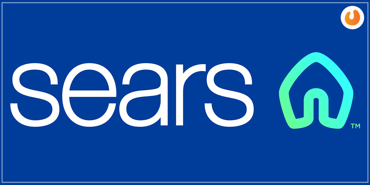
It’s understandable why you might want to look at other business logos before designing your own. It can inspire you to come up with yours. The problem starts when you copy something similar and try to pass it off as your own.
Lesson: Your logo must be unique to you and what your company represents. Have a look at your company values and beliefs and incorporate that into your logo. This guarantees some degree of authenticity.
Wrap up
Designing a business logo isn’t a task to be taken lightly. The wrong logo can contain innuendos that can alienate customers, attract incorrect interpretations, and in worst cases, lawsuits. Make sure you employ a professional graphic designer for the task. Ensure your business logo not only has a well thought out concept but brilliant execution.


")